AIRBNB
My name is Ryan Bernal. I'm a art director, photographer, and owner of a professional film lab.
I am a huge fan of airbnb and the way its business truly supports local and international communities. Over the past few years I have traveled internationally, domestically, as well as began hosting myself. I've fallen in love the opportunities airbnb has afforded me to engage with amazing people and authentically experience different cultures.
Through my continued interaction with airbbnb, be it the website, social channels, and interactions with airbnb's staff (as they requested and utilized a number of my photos for social and web platforms) I have become very familiar with airbnb's brand, content, and art direction.
The art direction and curation of content that airbnb employs is phenomenal. With that said, I believe there is room for improvement in the quality and consistency of airbnb's photos. I am writing this because I would like to help take aribnb's imagery to the next level by further improving the visual content's color, tonal characteristics, and consistency.
Like I mentioned above, I own and manage an analog film lab. This lab serves hundreds of the worlds remaining film photographers. The team I've developed and oversee specializes in color correction, consistency, understanding the unique desired aesthetic of each client, and executing it to the highest standards. We are entrusted to handle the work of many of the industry's top professionals and exist to ensure quality and consistency across all of their work.
As companies like airbnb utilizes more user generated content alongside professional content, it becomes increasingly important to have someone to ensure it all aligns with the desired aesthetic, and remains cohesive across all mediums.
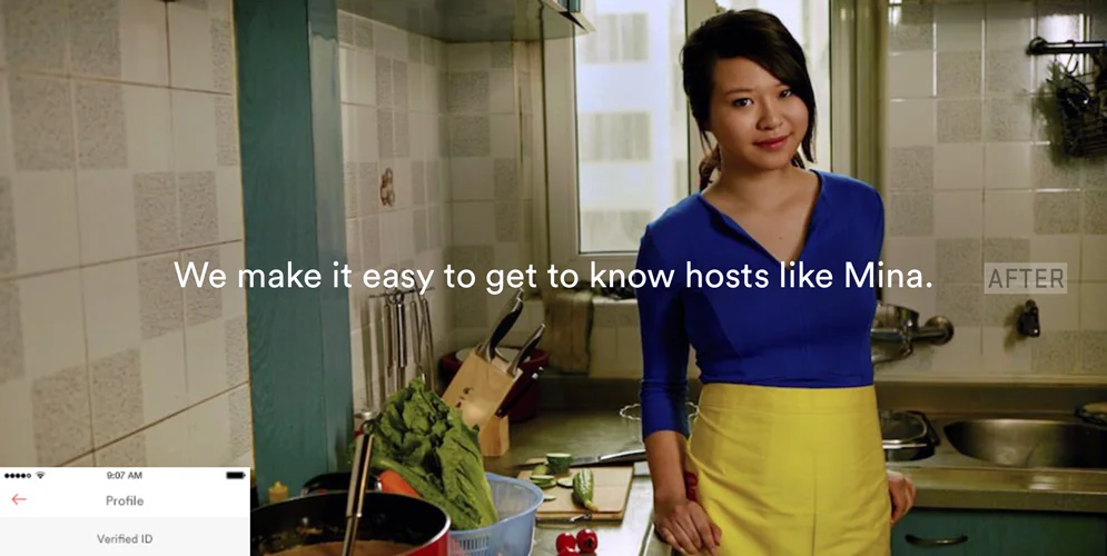
I created a series of "before" and "after" images to illustrate my point. I would recommend putting the slider to all "before" images and scrolling through the page, then to the "after"s and doing the same. This will help you get a sense of how consistency and image quality may be improved. While some edits are more dramatic than others, just sliding between the "before" and "after" of each image will also help.
All in all, I think airbnb is one of the most professional and important companies out there right now. It is my hopes to help bring airbnb's images up to the level of professionalism that they employ in all other facets of their business, marketing, and brand.
In Detail: It appears that many of the images have a yellow or green overlay or have been edited in such a way that give them an unnatural color cast. You can see the color casts in the whites and build up of the mid tones. More specifically (and most importantly), the skin tones in the photos often appear unnatural and unflattering. Lastly, the contrast and density of each image is often inconsistent from one image to the next, therefore the website's sense of continuity is lost. While I recognize there may be edits or effects applied to some of these images to achieve a certain look, I suggest that there are ways to achieve a specific "look and feel" while maintaining the integrity of all aspects of each photograph. Treating each image idiosyncratically, and not applying global effects, is the best way to maintain quality and consistency.
The the edits I've employed have a slight warm and light feeling aesthetic while keeping the skin tones natural. When an image is properly balanced with the skin tone as a priority, it appears natural, clean, inviting, and professional. I also slightly adjusted the tonal range of each photo to be properly balanced, allowing each image to pop yet not appear cloudy, washed out, or overly dense.